


“
”

Designing and developing a cohesive brand identity that recognises and celebrates prestige, compiled into a full graphic design suite that instils trust within the community.
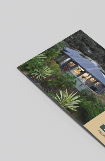
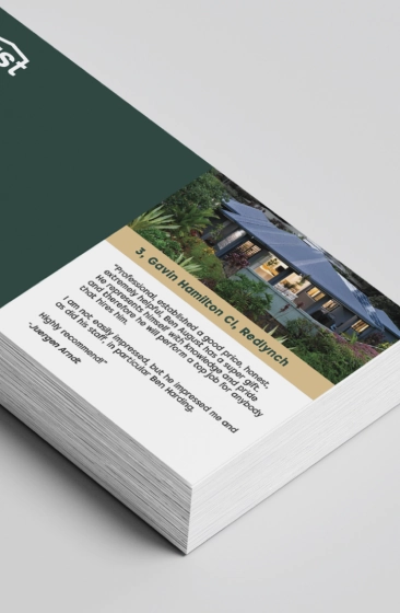
Modern design and cohesive branding for a growing real estate leader
Pivoting from his career as a solo real estate agent, Ban August launched August Estate Agents. Whilst a modern design was needed to stand out from his competitors, the main goal was to capture the trust and warmth that future home-buyers would respond to.
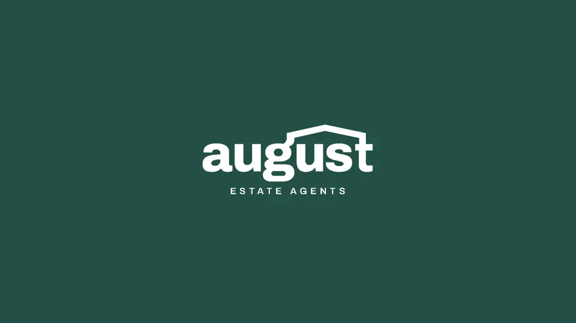
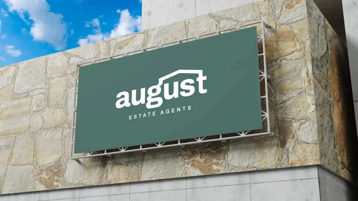
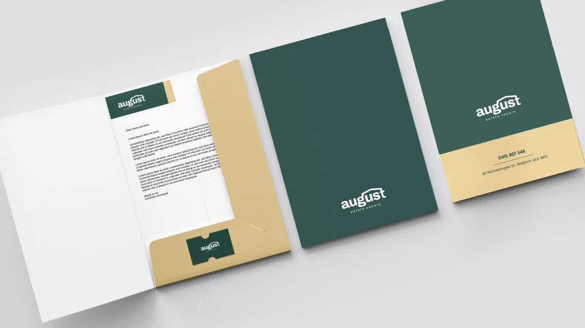
We began with the logo, developing a concept where the “g” and “t” in August connect to form a roof over "us" - tying directly into the personal nature of purchasing property. Forest green and gold became the hero palette, balancing prestige with approachability and setting the tone for a premium yet grounded brand.

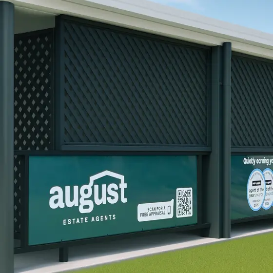

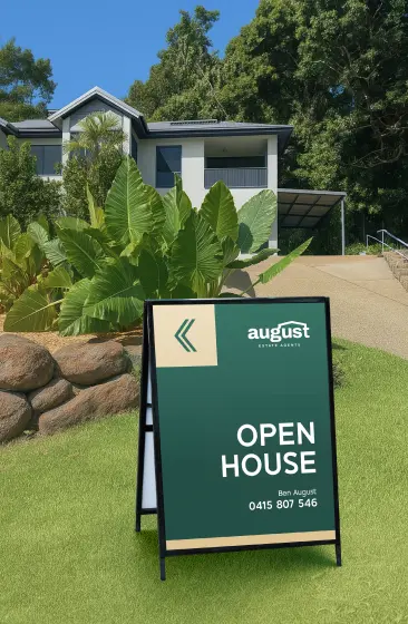
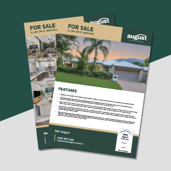
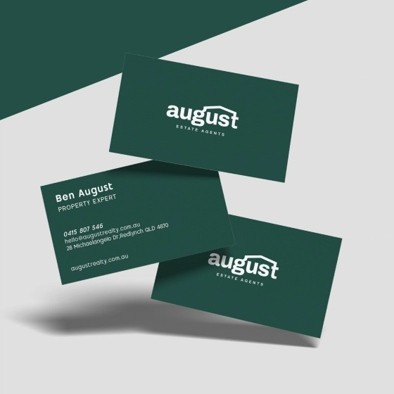
From signs to stationery, a consistent brand experience
Beyond the logo, we equipped August Estate Agents with all the assets needed for success. The fully branded suite included: for sale signs, A-frames, directional signage, business cards, and other printed assets.
The result overall was a polished, premium identity which resonated with clients who valued a professional and trustworthy agency. The distinct and meaningful design curated for August Estate Agents will go on to support a strong foundation for future growth, whilst being easily recognisable in the local market.


“
”
–
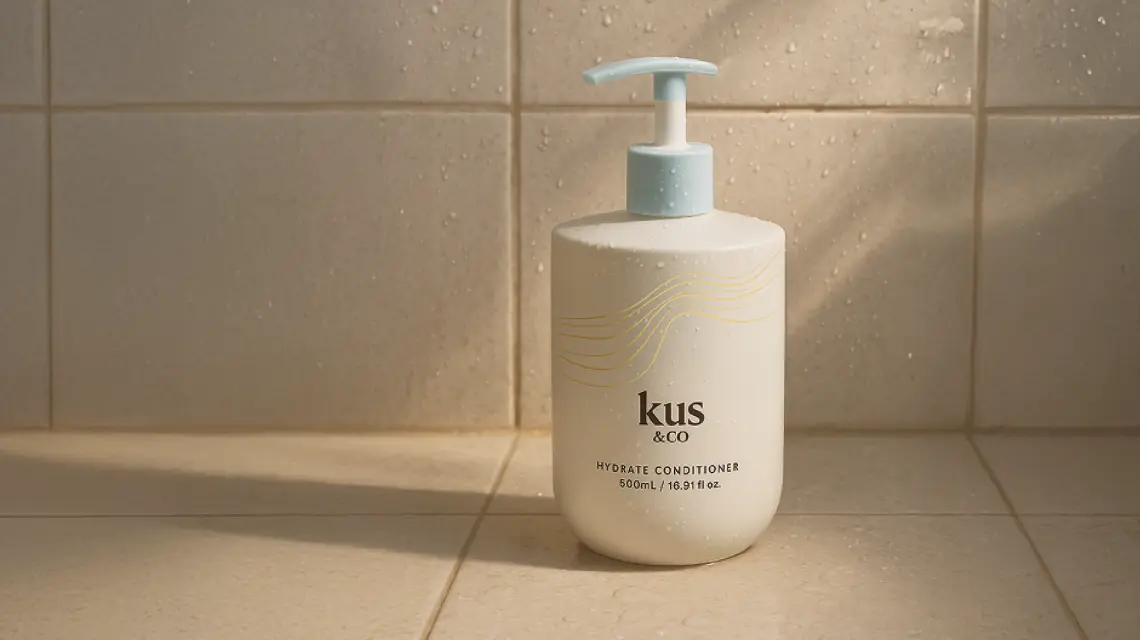
Elevating a vibrant hair care brand with a refreshed identity, high-converting website, and standout social campaign.
Enhancing Sunlover Reef Cruises' digital presence and marketing materials to solidify their position as a premier Great Barrier Reef tour operator.

Branding a Cairns-based brewery that prides itself on using Copperlode Dam’s pristine water—making every beer truly special.
