
The right time to rebrand is when your brand no longer matches the business behind it. You have outgrown what you sell, who you sell it to or how seriously you want to be taken, and the gap between how good you are and how good you look is starting to cost you work.
A rebrand is not a fresh coat of paint because you are bored of the old colour. It is a repositioning exercise, and the visuals are the last part of it.
Plenty of rebrands should never have happened. Hold off if the real story is one of these:
If your brand is strong but tired, you may only need a refresh: tightened logo, updated palette and typography, consistent templates. That is a fraction of the cost and keeps the equity you have built.
We have run the same process for brands as different as a tier-one construction company, a Great Barrier Reef cruise operator and a community services organisation. The steps do not change. The outcomes could not look more different, and that is the point.
Every rebrand we run starts with a Spark Session, a structured discovery workshop where we break down your market position, your ideal client, your goals and the hurdles in the way, and unpack the brand in detail. No fonts, no colours, no sketches. If a studio starts showing you logos before they can explain your market position back to you, walk.
Before any logo is drawn, we build stylescapes: wide-format visual direction boards that put imagery, typography, colour and texture together in context, so you react to a complete visual world rather than guessing from three random logo concepts. The method was popularised by design educators The Futur, and it is the single best cure for the endless revision cycle. You lock in a direction first, then design inside it.

This is a section of a real stylescape from our work on underwear label Iddy. Imagery, type, colour and texture sit together in context to give everyone a feel for what the brand will feel like, so the whole room is on the same page before anyone moves to logo design.
For Reef Magic, a leading Great Barrier Reef tour operator in a fiercely competitive market, that direction work is what separated a brand refresh from decoration. The identity had to feel bright, premium and unmistakably of the reef before a single lockup was designed.
Only once the direction is agreed does logo design begin: the mark itself, the lockups, the wordmark, tested at every size from a favicon to a site hoarding. Because the strategy and direction are settled, this stage moves fast and the first concepts land close.
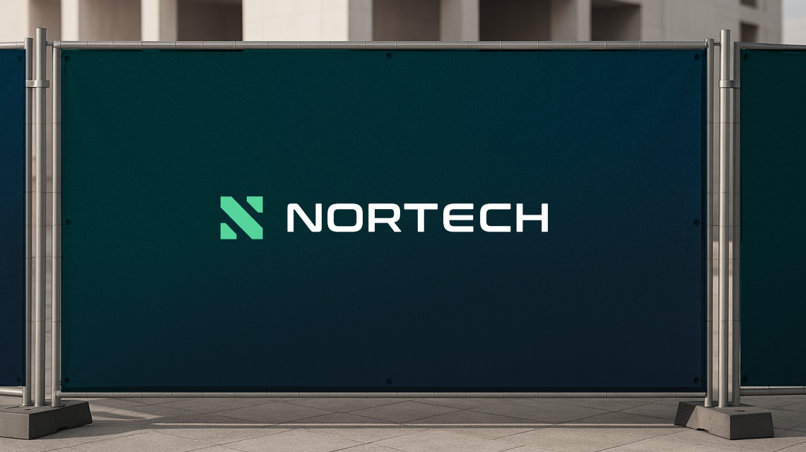
Nortech came to us to be repositioned as a professional, future-focused tier-one construction company. The new identity had to carry that ambition on tenders, signage, fleet and a rebuilt website, which is exactly where a logo designed inside a strategy earns its keep.
The logo is maybe ten percent of the job. The rest is the supporting cast: brand guidelines, stationery, templates, signage, social assets and the website, so the new identity shows up consistently everywhere your customers meet you. A rebrand that ships as a logo file and nothing else falls apart in a month.
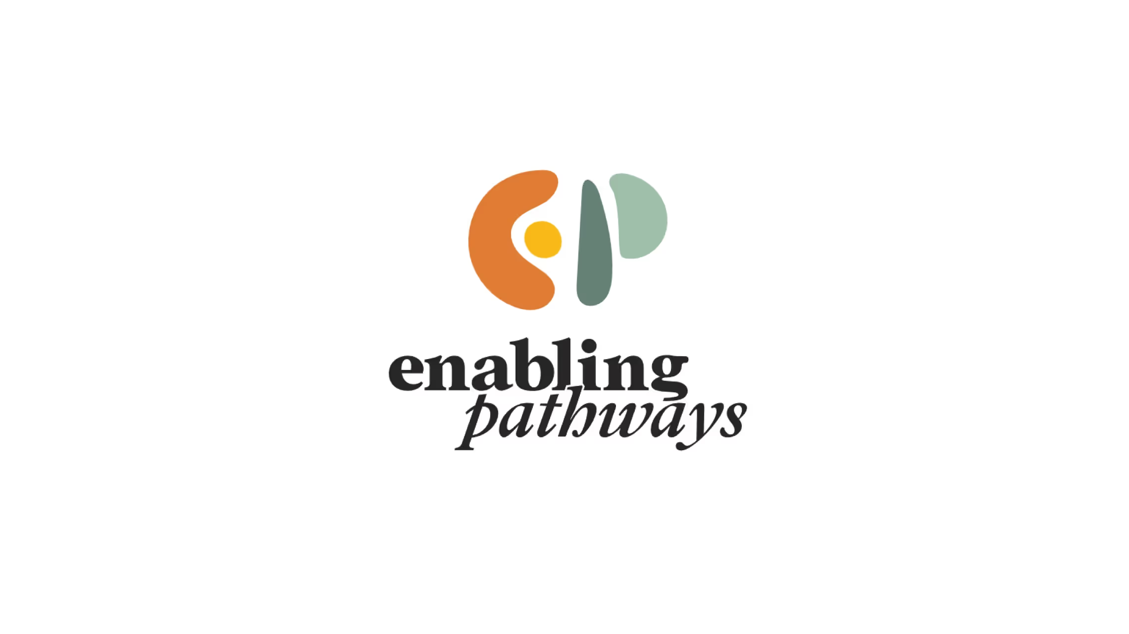
Enabling Pathways, a Far North Queensland organisation supporting people with disabilities, those facing homelessness and youth in need, needed warmth and trust rather than corporate polish. Same process, completely different result, because the strategy called for it.
If a studio can answer those clearly, you are in good hands. If the answer is "three concepts and two rounds of revisions", keep looking.
The best time to rebrand is before the old brand starts costing you opportunities you never hear about. If any of the signs above hit close to home, take a look at our logo and branding services, browse the recent projects mentioned here or get in touch for an honest read on whether you need a rebrand, a refresh or neither.