

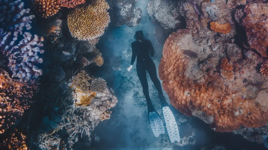
Designing and developing an online platform dedicated to recognising the Great Barrier Reef’s remarkable legacy, culminating in a campaign to nominate it for a lifetime achievement award.
A national, well-recognised brand combining corporate scale with local expertise, brought to life through a modern website and a results-driven digital marketing campaign.

Branding a Cairns-based brewery that prides itself on using Copperlode Dam’s pristine water—making every beer truly special.

Modernising Fowler’s Group’s online presence with a flexible, user-friendly website, seamlessly migrating existing pages and blogs from a custom framework.

Elevating Kus Culture's e-commerce success through strategic conversion optimisation and interactive engagement tools in the competitive hair care market.

Capturing the immersive Jungle Tours experience through dynamic visuals, showcasing their unique adventures to Cape Tribulation and the Daintree.

A comprehensive brand overhaul and digital strategy that transformed Collins Constructions into a market leader in commercial design and construction in Far North Queensland.

Cairns Hardware, a staple in Queensland’s trade industry, partnered with us for a digital marketing overhaul, combining video content and social media strategies to grow their market presence.


